Every year, all the designers around the world wait for
Pantone’s yearly announcement for “Color of the Year”. This announcement
identifies the characteristics of next years visual trends From home decor to web design, there is no
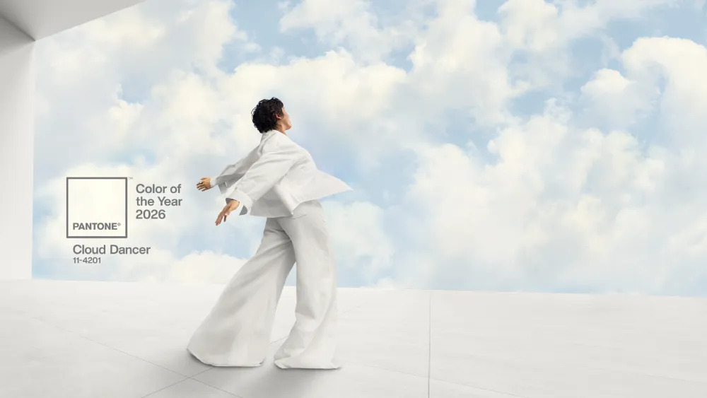
field that doesn’t shape with Pantone. This years choice is announced as: “Cloud Dancer”
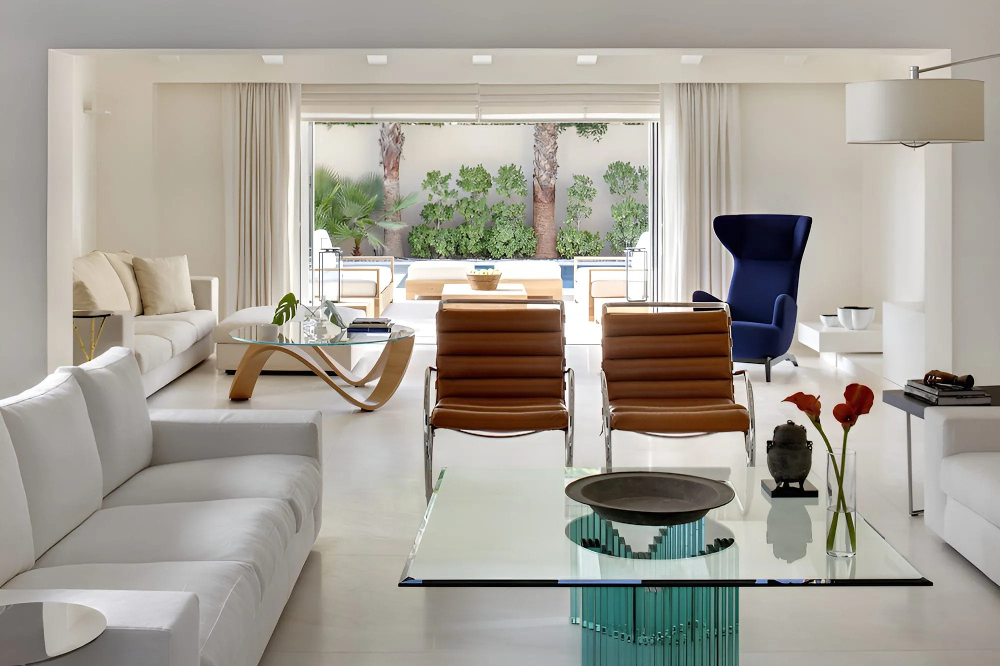
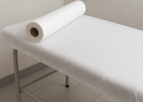
We can describe this color as, well… “white”. Optic white is
the most common description of this color since it doesn’t include any othe
undertones.
However; this choice shocked many of the respectives. As
white can be widely used by any field or color pallette, it also never needs to
be a trend. As Pantone described, white can help any other color to shine while
bringing a softness and freshness to used area. We can assume that Cloud Dancer’s
itself won’t be the star of year, but how we combine it. This way, Pantone is
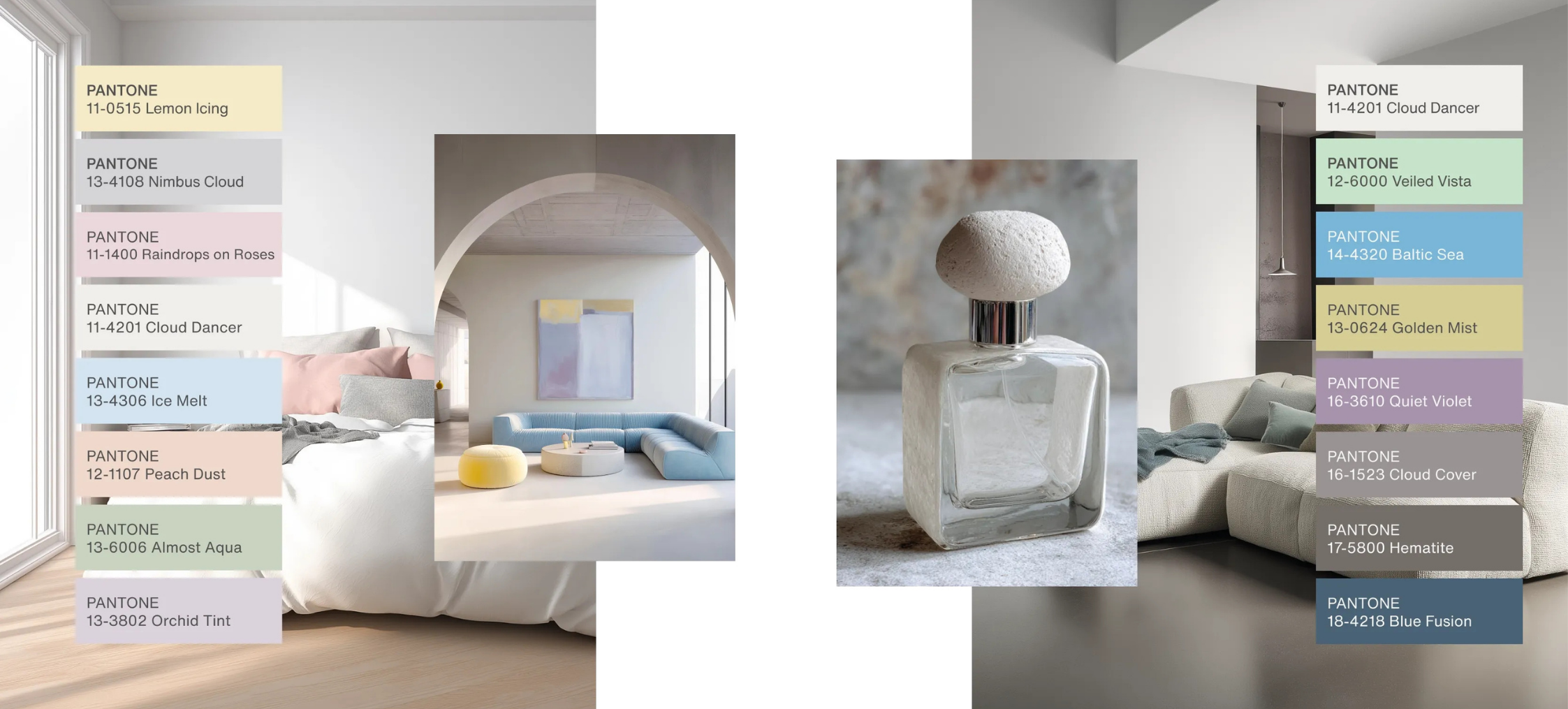
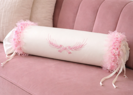
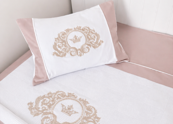
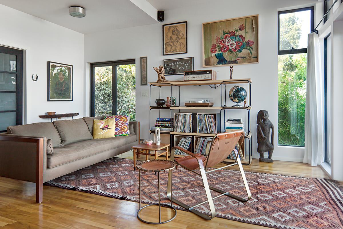
giving a big open field for designers tos how their art. You can see some of
the example color choices for Cloud Dancer made by Pantone.
Cloud Dancer might be the center of attention but absolutely
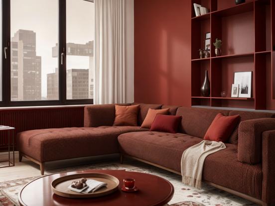
not the only color we will see this year. Burgundy has been a huge trend for
last few years and it is keeping the popularity this year too When it comes to home decor, burgundy gets
abit of “natural” twist and used more with a brownish tone.
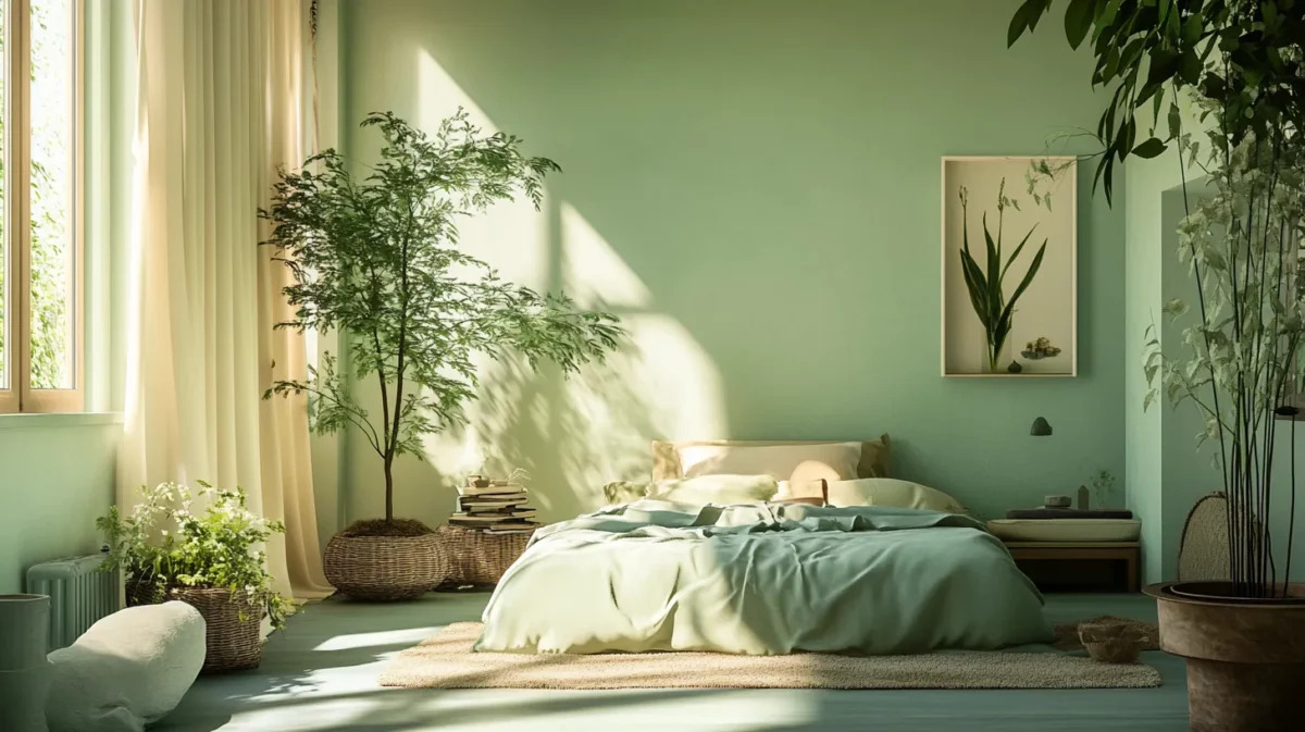
Another hit of this season is olive green. From bright scale
to more muted tones, every hue of this color will be widely seen.
As a good match for upper examples, we will also have
neutral tones in trend. Browns, beiges, coppers and oranges are great for completing a color
pallette for this year.
Source: DECORILLA, Catherine W.
Surprisingly, it looks like color of the year will be donating us with even more colors this year and help us bring back the fun that we lost.